
Color is often misunderstood in the world of luxury interiors.
For some, it feels too risky, too loud, too unpredictable. But the truth is, when used with care and intention, color can add depth, clarity, and emotion to even the most refined spaces. It doesn’t need to dominate the room to make a statement. In fact, the less color you use, the more impact it tends to have.
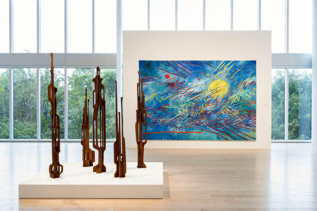
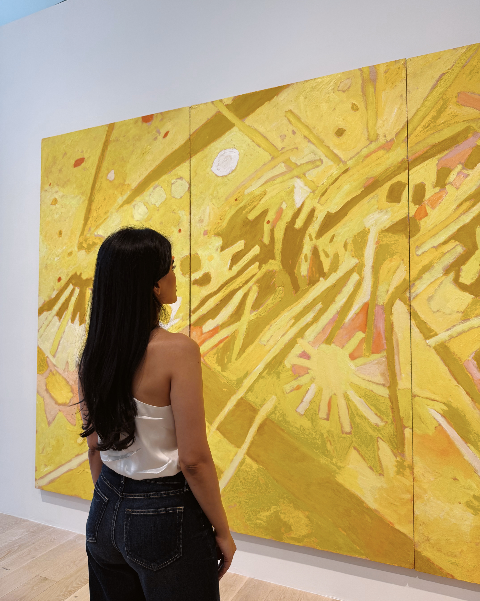
That realization was echoed for me during a recent visit to the Institute of Contemporary Art in Miami. I was there to see Mildred Thompson: Frequencies, a body of work filled with rhythm, movement, and unapologetically expressive color. At first glance, Thompson’s palette might seem worlds away from my own. Her canvases are bold and layered, mine are often restrained and quiet. But what moved me most wasn’t the intensity of her work, it was the clarity. Every color she placed had purpose. There was no hesitation. That kind of decisiveness is what makes bold design feel elevated rather than chaotic.
It made me reflect on how I approach color in my interiors. My style is rooted in refinement. I don’t aim to flood a room with saturation, but I do believe every space deserves a moment of expression. Sometimes that shows up in a teal bar that interrupts a palette of black marble and steel. Other times, it’s in a set of cornflower yellow dining chairs that offer relief from the gravity of black kitchen cabinetry. These aren’t random choices. They’re visual cues that shift the energy of the room and guide the eye with intention.
One of the most important lessons I’ve learned through both art and design is that color must begin with feeling. In Mildred Thompson’s work, you can sense the emotion before you can even identify the shapes. The colors carry rhythm, memory, and energy. That’s the same way I think about interior spaces. Before selecting any shade, I ask how the room should feel. Should it evoke calm or energy? Should it feel grounded or alive?

Color is not an afterthought. It’s a decision that happens early and anchors everything else. When used well, a single hue can shape the entire narrative of a room. That’s what I find most powerful about using color in refined interiors. It doesn’t need to appear everywhere to define the space. It just needs to appear with meaning. Whether it’s a whisper of warmth in an otherwise cool-toned room or a punch of saturation that stops you in your tracks, color should serve an emotional purpose.
For anyone afraid of bold hues, the secret is to start with a single point of focus. One statement. One place where color can exist without competition. That clarity is what gives the room confidence. It tells the story without shouting.
Mildred Thompson’s work also reminded me that boldness has nothing to do with volume. Each piece had one central gesture or movement that everything else responded to. That’s the kind of clarity I look for in my interiors. You don’t need five statement pieces. You need one. And that one should be the thread that pulls the room together.
In design, that moment could be a striking piece of furniture, a textural rug in an unexpected tone, or a richly colored island that punctuates a quiet kitchen. I often find that restraint makes these moments even more powerful. Because the eye has space to land, the color carries more weight. When everything competes for attention, nothing stands out. But when one bold gesture is allowed to exist on its own, it elevates everything around it.
In one project, I paired soft black cabinetry with dining chairs upholstered in a rich cornflower tone. That single color choice gave the space warmth and personality without interrupting the overall sense of calm. In another, a teal bar brought a sense of play to an otherwise structured room. These moments don’t shout. They speak clearly and confidently.
Another moment of clarity came while walking through the same museum, where a sculptural piece by Leilah Babirye caught my attention. The base was stark and white, almost architectural in its stillness. Then came the disruption—flashes of saturated color layered and dripping sparingly across the surface. The placement felt chaotic at first, but on closer inspection, it revealed a kind of quiet control. The contrast between form and hue, between absence and presence, made the work impossible to look away from.
That experience reaffirmed something I hold true in design. Color doesn’t need to be everywhere to make an impact. In fact, the more selective its placement, the more magnetic it becomes. When a space is built with restraint, a single instance of color can carry emotional weight and visual power. It becomes a focal point, not a flourish. Just as that sculpture commanded attention through deliberate disruption, a well-placed pop of color in an interior—whether a vibrant bar, a jewel-toned chair, or an unexpected accent—can energize an entire room without disturbing its refinement.
This approach is what gives a refined space its edge. The clean architecture, the tonal restraint, the curated finishes—all of it creates a foundation. But it’s the single moment of color that adds emotion. That creates memory. That makes the room unforgettable.
Contrast is one of the most powerful tools a designer has. Not just between light and dark, or smooth and rough, but between quiet and expressive. When you create a space with a sense of stillness, it becomes the perfect canvas for a single bold gesture. And when that gesture is color, the impact is immediate.
Think about a gallery wall painted in the softest gray. Now imagine a single abstract piece in vibrant red. That red doesn’t just decorate the wall. It defines the entire space. Or picture a dining room that’s nearly monochromatic until the light shifts and reveals a subtle gloss on the walls or a flash of gold beneath the table. These moments are never accidents. They are carefully placed and deeply considered.
In my own work, I use color as a tool to guide movement and emotion.
A teal bar isn’t just a moment of vibrancy. It’s a transition point between rooms. A cue that the energy of the space is shifting. Cornflower chairs become not just seating, but punctuation marks in a sentence written in stone, wood, and glass. These gestures are small in scale, but large in impact.
When people think of a bold kitchen, they often imagine a room drenched in color. But a bold kitchen can be something quieter and more intentional. It can be a single cabinet finished in a lacquered tone, a pendant light in deep bronze, or a floor in richly veined marble that becomes the centerpiece. Boldness is not about volume. It’s about vision.
The same principle applies whether you’re designing an entire home or refreshing a single room. You don’t need more color. You need better placement. Start by asking what you want the space to feel like. Then let that guide your choices. Color can be cool or warm, loud or soft, grounded or ethereal. It is as nuanced as the materials that surround it.
The key is to treat color as part of the architecture, not as an accessory. Let it have structure. Let it have purpose. And above all, let it live in contrast with the quieter elements of the room so that it can truly speak.
Designing with color is about confidence. It’s about trusting your instincts and giving yourself permission to be expressive in small, powerful ways. Luxury is not about playing it safe. It’s about knowing what to edit, what to amplify, and how to tell a story that feels both timeless and personal.
It’s not about doing more. It’s about doing it better.